Survey Creation
Survey Creation
Overview
The Survey application in the Meru Data Governance Tool allows you to conduct surveys to gather information related to different systems in the data map, as well as to gather information from different sectors, people and parties within and outside the organisation. These surveys can be distributed to internal or external parties and among individuals or groups to collate information from various sources. This information can then be mapped to the DataMap.
To create a survey, follow these steps:
- Log in to your Data Governance Tool account.
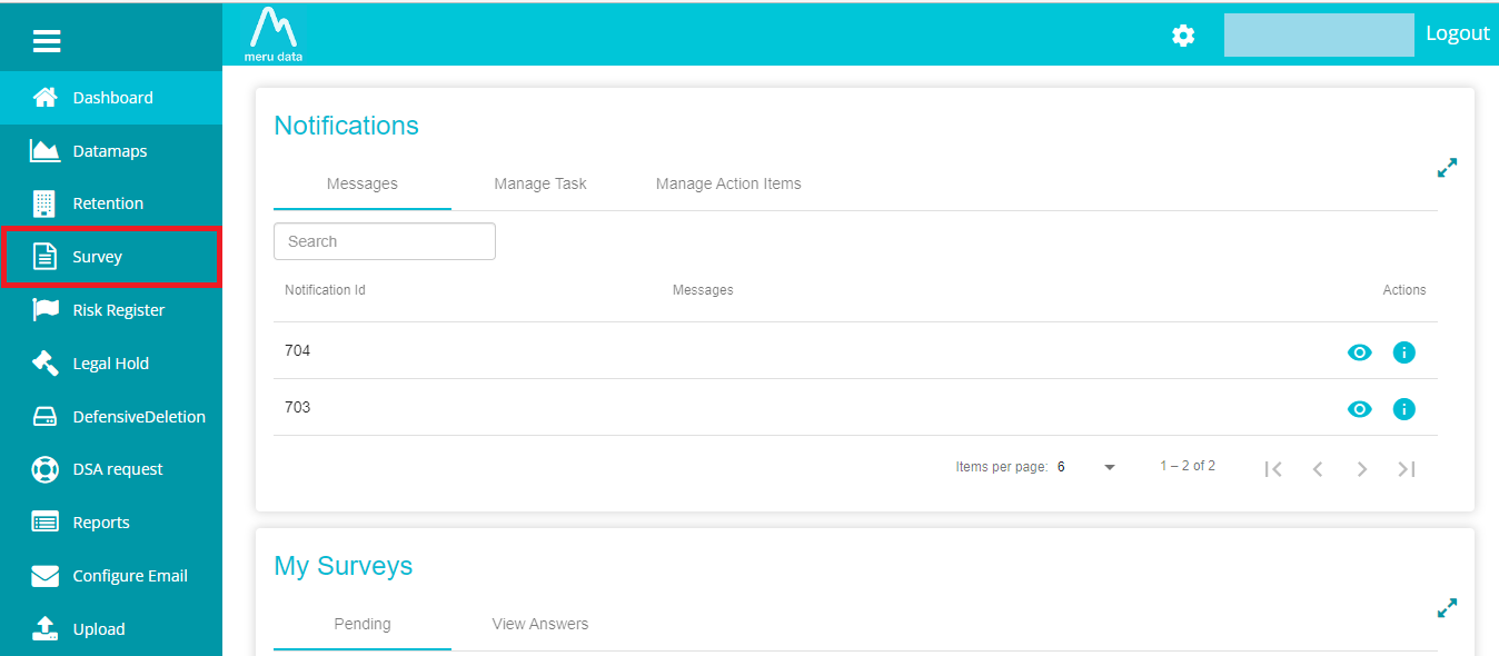
- From the hamburger menu present on the top left corner of the Dashboard, click on Survey
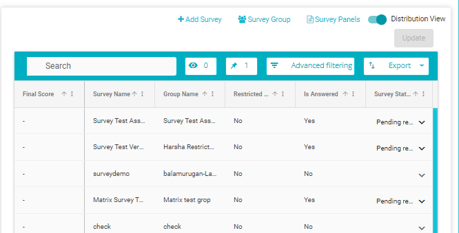
Once on the Survey page click on the + Add Survey button
The Survey Generator will open
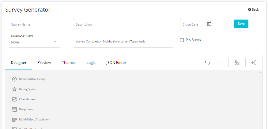
First specify the Survey Name, Description and Close Date Note: These fields are mandatory
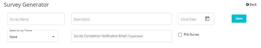
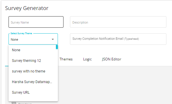
Next, from the drop-down menu, you can select a pre-existing theme
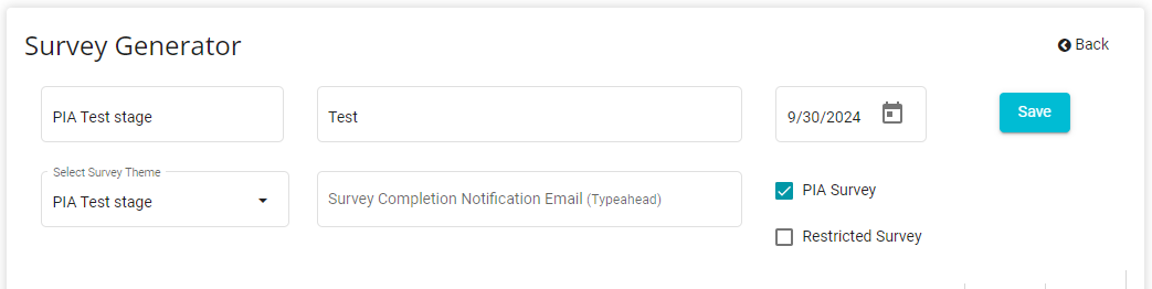
Ensure to enter the right Survey Completion Notification Email as well as to tick the box for the PIA Survey upon your option.
You also have the option to select for Restricted Survey.
- Once the Survey has been configured, click the Save button to add
the survey to the list of existing surveys and to ensure the
configuration isn't lost\
Designer Tab
On the Designer tab you can select and configure and design the questions for your survey.
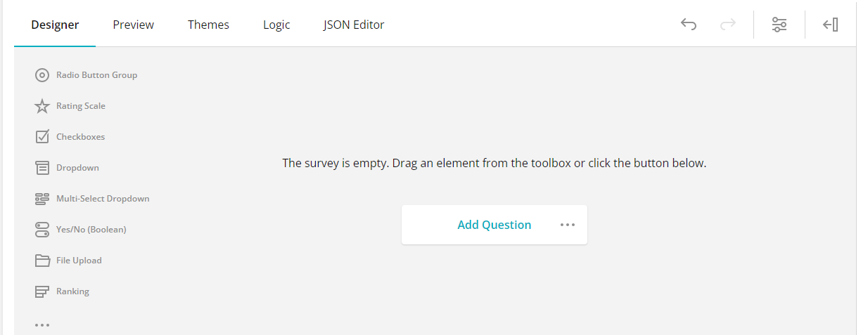
The toolbox on the left provides available question and panel types. From here, you can drag and drop the question of your choice. Only once a question has been selected, can the Survey Title and Page name be specified.
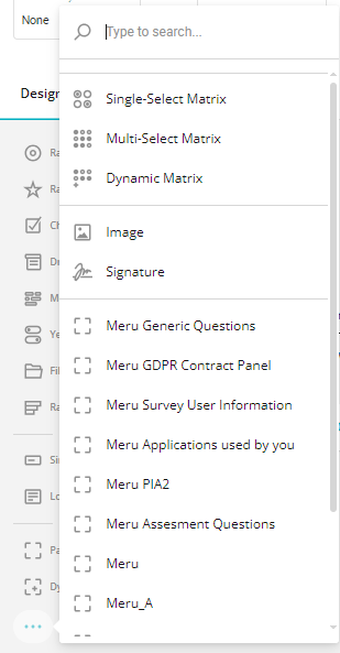
Questions - Toolbox
- Radio Group Button
This question allows the respondent to select any of the predefined
options. Any number of options can be defined here.
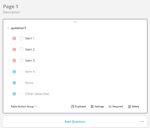 Click on the
  button to add additional options.
Click on the  button to remove any option.
Use the button to the left of the option to drag/drop and reorder the
options. Hover over this area to see the button
button to remove any option.
Use the button to the left of the option to drag/drop and reorder the
options. Hover over this area to see the button
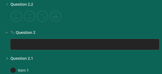
- Rating Scale
This question allows respondents to provide their answer in the form of
a rating. The extent of the scale can be defined here.

Click on the button to add additional labels.
Click on the button to remove labels.
Click on the Label to edit its value

- Checkboxes
This question allows respondents to select multiple answers from the predefined options. Any number of options can be defined here.
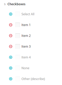
Click on the button to add additional options.
Click on the button to remove any option.
Use the button to the left of the option to drag/drop and reorder the
options. Hover over this area to see the button
- Dropdown
This question provides respondents with a drop-down menu containing predefined options. Any number of options can be defined here.

Click on the button to add additional options.
Click on the button to remove any option.
Use the button to the left of the option to drag/drop and reorder the
options. Hover over this area to see the button
- Multi-Select Dropdown This question provides respondents with a drop-down menu from which multiple options can be selected. Any number of options can be defined here.
 An example of a multi-select drop-down is shown below
Click on the button to add additional options.
Click on the button to remove any option.
Use the button to the left of the option to drag/drop and reorder the
options. Hover over
this area to see the button
Yes/No Boolean With this question, respondents can select one of two options
 Click on the options to edit its value

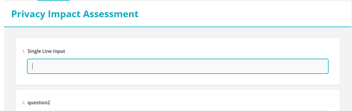
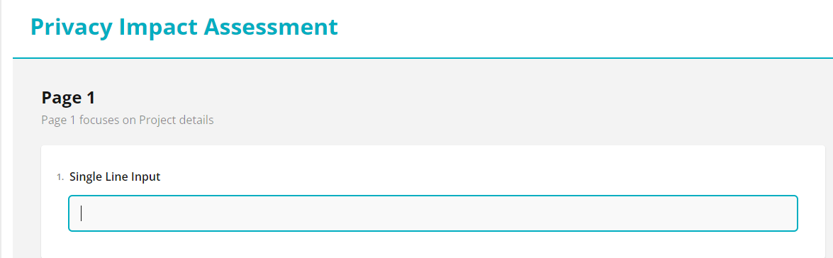
Single Line Input This question allows users to enter any value of their choice as the answer. However, the answer is limited to a single line i.e., there is a limit on the number of characters accepted.
 From the drop-down, you can select the kind of value accepted as the
answer.
From the drop-down, you can select the kind of value accepted as the
answer.Long Text This question allows users to enter any value of their choice as the answer.

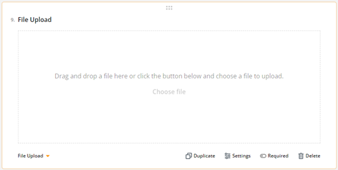
File Upload This question allows respondents to upload a file as their response
Ranking This question allows responders to re-arrange and rank the answer options according to their choice

Click on the option to edit its value
 Click on the button to add additional options.
Click on the button to remove any option.
Use the button to the left of the option to drag/drop and reorder the
options. Hover over this area to see the button\
- Image
With this feature you can add an image to your survey. The image
feature is available on the Toolbox on the left of the screen.
An example of an image in the survey is shown below

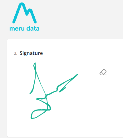
Signature With this feature you can provide respondents with the ability to add a signature to your survey. The image feature is available on the Toolbox on the left of the screen.
An example of an image in the survey is shown below
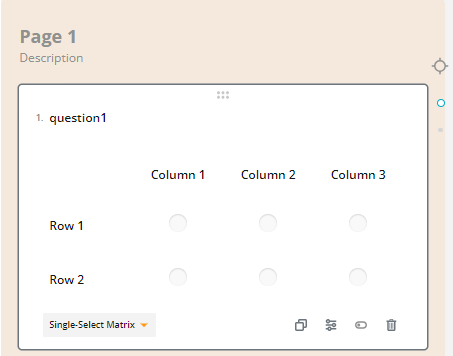
Single Select Matrix
Panels - Toolbox
The questions on the survey can be categorized into panels i.e., you can organize the questions on the survey into sections.
DynamicPanel
This feature allows users to add and answer questions as many times as required.

Survey Title
Here you can add a title that will be visible to respondents at the top
of the questionnaire
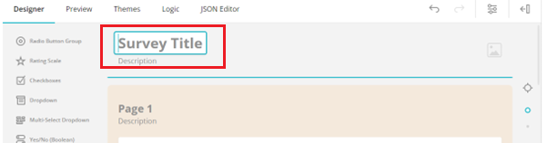 An example of a title once added to the survey is shown below
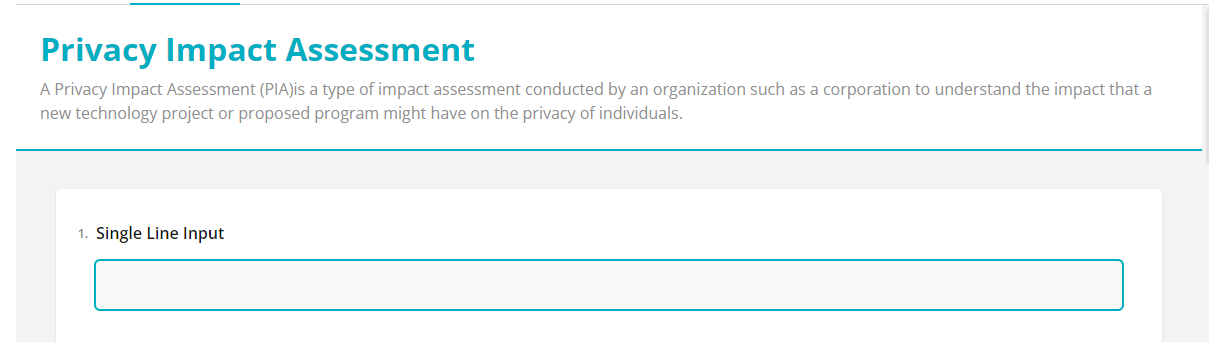
Survey Description
Below the Survey Title, you can provide a description for the survey
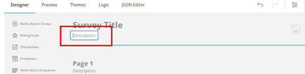 An example of a description once added to the survey is shown below
Survey Logo
With this feature, you can add an image/logo to your survey. To do so,
click on the image button, and upload an image file from your device
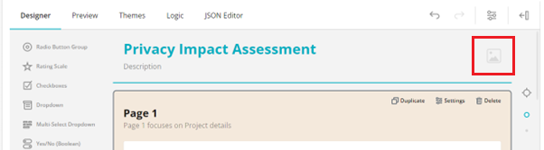
An example of a survey image/logo, once added to the survey is shown
below
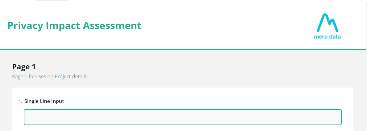
Pages
Multiple pages can be added to the survey, each page can be titled
differently, and a description can be added to each. Click on the Page
field or the Description field to edit them
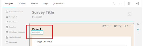
An example of the Page details once configured is shown below
Survey Settings
Click on the Survey Settings icon to open the settings panel
Here, you can configure various aspects of the survey
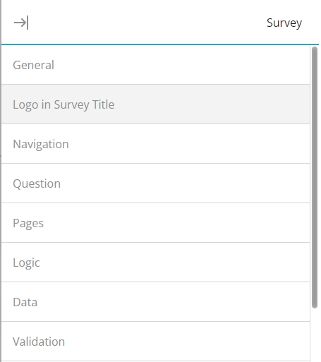
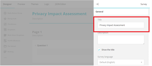
General
Under the General Section, the following configurations are available:
- Title
Here you can add/change the title of the Survey if required
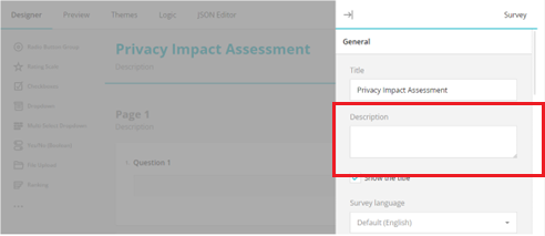
Description Here you can add/change the description of the survey if required
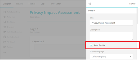
Show the title Uncheck the box to remove the survey title from display
Survey Language
From the drop-down select the language that the survey should be displayed in
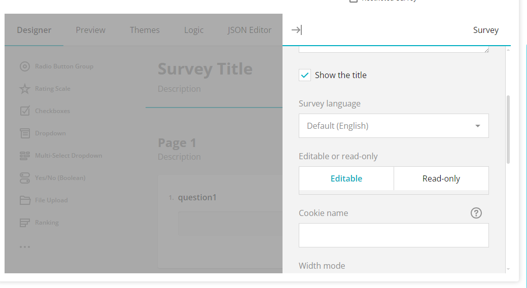
Editable or read-only Choose whether the survey should be read-only or editable. Read-only allows the respondents to read all the survey questions while making the survey editable will allow respondents to provide their answers to the survey

Cookie name
Here you can provide the name for the survey cookie. A cookie is stored
for the survey to avoid users filling out the same survey twice

Width mode -Here you can configure the display of the survey on the screen --Auto; Static places the survey in the centre of the screen, while Responsive places the questions to the left side of the screen. -If Static is selected, then the width of the survey can be configured in the field that appears

Fit to container -Here you can configure
 Logo in Survey Title
Under the Logo Section, the following configurations are available:
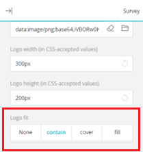
- Logo (URL or base64 encoded string)
Here you can add the logo URL or the logo base64 encoded string. If you
have added the logo via the Logo icon, the string will be
displayed here
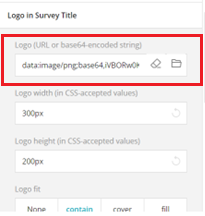
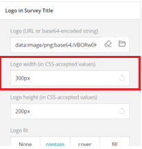
Logo width (in CSS accepted values) Here you can configure the display width of the logo
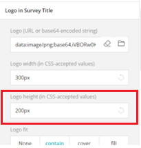
Logo height (in CSS accepted values)
Here you can configure the display height of the logo
- Logo fit
Here you can choose how the logo should fit on the survey
Navigation
Under the Navigation Section, the following configurations are available:
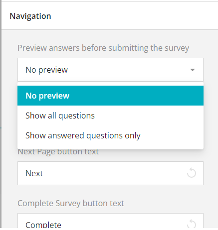
Preview answers before submitting survey From the drop-down, you can choose how the answers should be previewed before submitting the survey
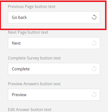
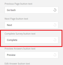
Previous Page button text Here you can enter the title of the previous page back
Next Page button text
Here you can enter the title of the next page button
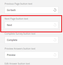
- Complete Survey button text
Here you can enter the title of the complete/submit survey button\
Previous Answers button text Here you can enter the title of the previous answers button
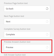
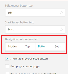
Edit Answer button text Here you can enter the title of the edit answer button
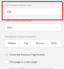
Start Survey button text Here you can enter the title of the start survey button
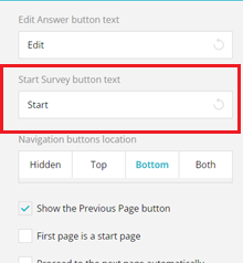
Navigation button's location Here you can choose where the navigation buttons should be displayed on the survey screen
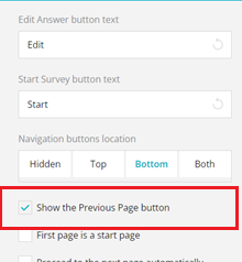
Show the Previous Page button Check this box if you want the Previous Page button to be displayed on the survey
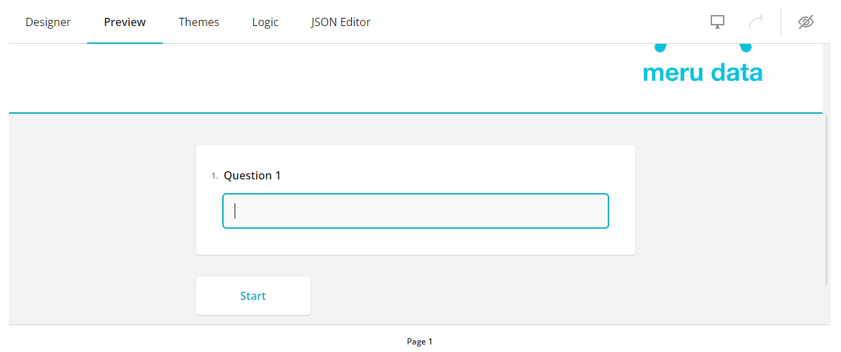
First page is a start page\ Check this box if you want the first page of the questionnaire to display the Start survey button. An example is show below
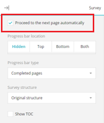
Proceed to next page automatically When this box is checked, the survey will move to the next page once all the questions on the current page have been answered and the respondent click the Enter button on their keyboard.
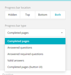
Progress bar location Choose the location of the progress bar. The progress bar shows the respondent how far along they've come with answering the survey. An example of the progress bar is shown below

Progress bar type From the drop-down menu, select the type of progress bar to be displayed
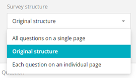
Survey structure From the drop-down menu, select the structure of the survey
Show TOC If this box is checked, then the different page numbers will be visible on the survey screen. Users can use this bar to navigate the different survey pages. This bar can be configured to be displayed on the right or left of the screen. An example is shown below

Question
Under the Question Section, the following configurations are available:
Question Title location Here you can choose where the question title should be displayed
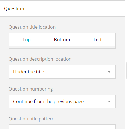
Question Description location From the drop-down, select where the question description should be displayed

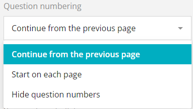
Question numbering From the drop-down select how the questions should be numbered
Question title pattern
Required symbol Here you can enter the symbol that conveys to the respondent that the particular question needs to be answered for the survey to be submitted.
Start index Here you can enter the first index value of the questions. In the example below, the first index value entered is K. Hence the following questions continue from the letter K

Error message location Here you can choose whether the error message should be displayed at the top or bottom of the survey screen.
Focus first question on a new page
Element order on the page
Maximum answer length Here you can define, in characters, the maximum length of the survey answers

Maximum comment length
Auto expand comment area if necessary
Allow users to resize text areas
Pages
Under the Pages Section, the following configurations are available:
Add Pages button Click this button to add additional pages to your survey.

Delete button Use this button to delete any page

Show page titles\ Check this box to display the Page titles on the survey

Show page numbers Check this box to display the page numbers on the survey

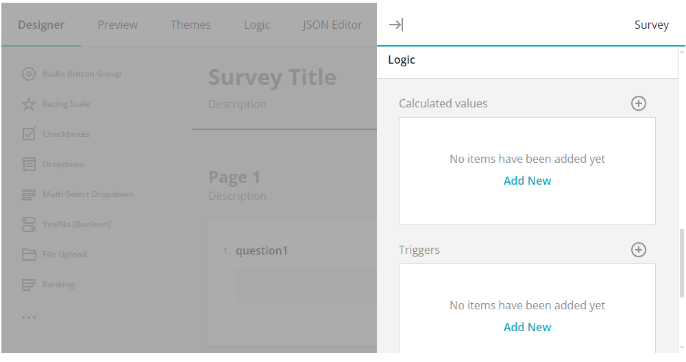
Logic
Under the Logic Section, the following configurations are available:
Calculated values
Triggers
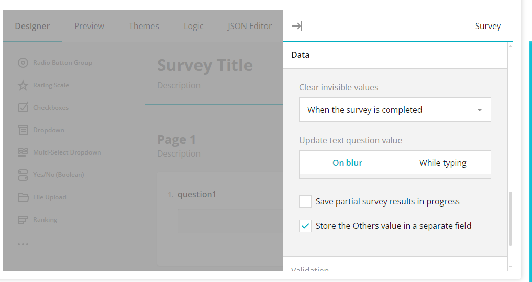
Data
Under the Data Section, the following configurations are available:
Clear invisible values
Update text question value
Save partial survey results in progress
Store the others value in a separate field
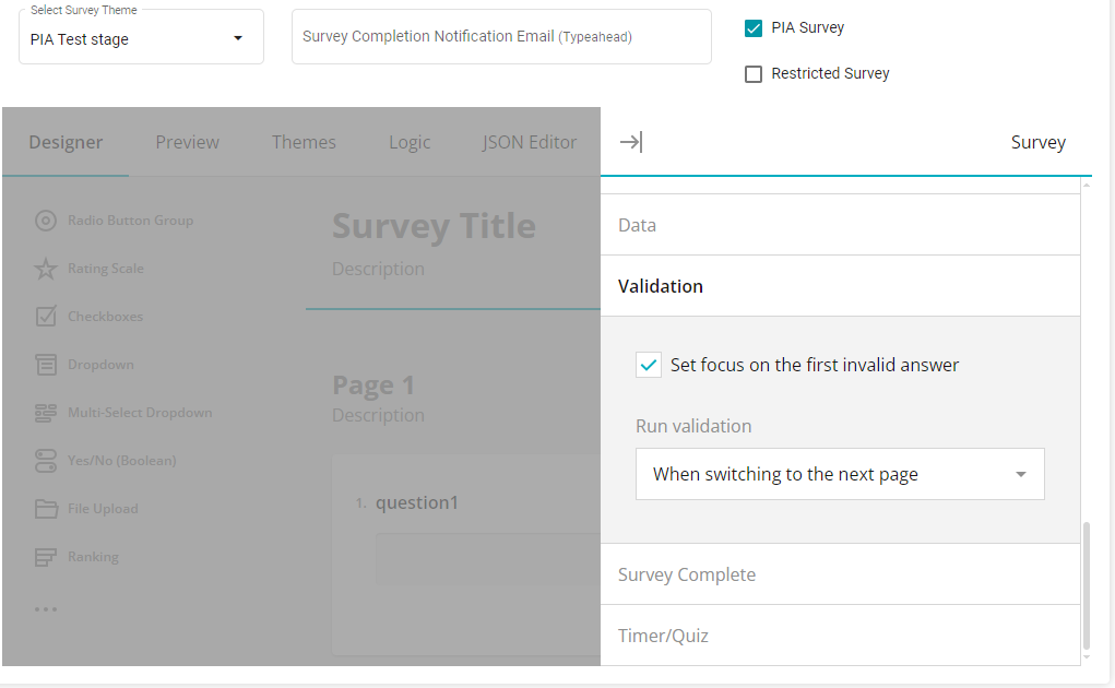
Validation
Under the Validation Section, the following configurations are available:
Set focus on the first invalid answer
Run validation
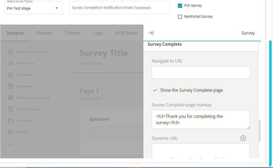
Survey Complete
Under the Survey Complete Section, the following configurations are available:
- Navigate to URL
Enter the URL of the page that users should be navigated to once the survey has been completed
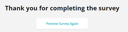
Show the survey complete page Check this box to display the page that informs respondents that the survey has been completed. An example is shown below
Survey complete page markup Here you can enter the text to be displayed on the Survey Complete page
Dynamic URL
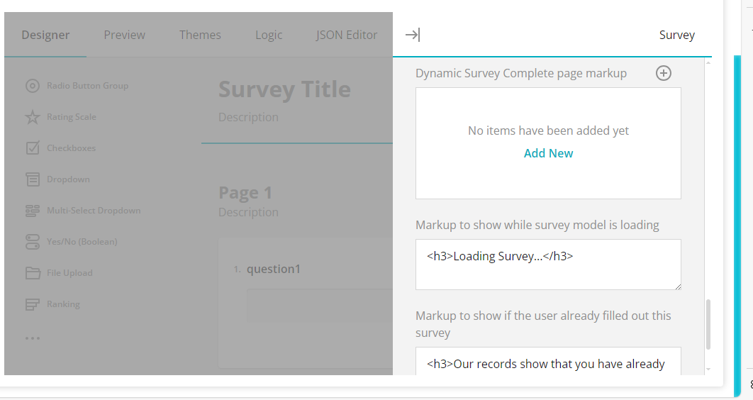
Dynamic Survey Complete page markup
Markup to show while survey model is loading Here you can enter the text to be displayed while the survey is loading
- Markup to show if the user already filled out his survey
Here you can enter the text to be displayed if the user has previously
filled out the same survey
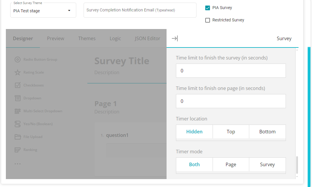
Timer Quiz
Under the Timer/Quiz Section, the following configurations are available:
Time limit to finish the survey (in seconds) Here you can define the time within which the respondent must answer the survey
Time limit to finish one page (in seconds)
Here you can define the time within which each survey page must be completed
- Timer location
Here you can choose the location of the survey timer
- Timer mode
Here you can choose whether the timer is configured for the entire survey, for each page or for both
Question Settings
The settings of each question can also be configured by clicking on the
Settings icon on the required question
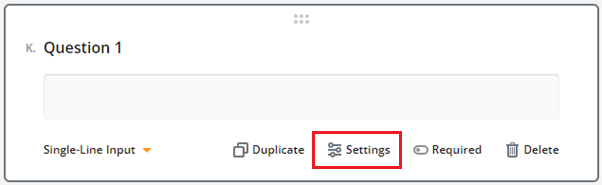
-Duplicate: This button enables you to duplicate the question
configuration selected.
-Settings: You can use settings to configure many features as shown
below.
-Required: Enabling this toggling will make the question mandatory when answering the Privacy Impact Assessment. -Delete: This is to delete the present question.
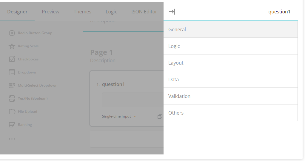
On clicking this icon, the Settings panel for that question will appear

General
Under the General Section, the following configurations are available:
- Name
Here you can define the name of the question
 2. Title
Here you can define the title of the question that will be visible
to respondents
2. Title
Here you can define the title of the question that will be visible
to respondents

Description Here you can add the description for the question if required

Visible Uncheck this box if you do not want the question to be visible on the survey
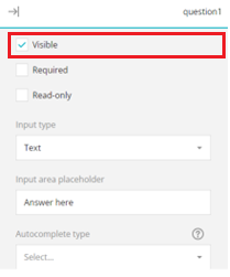
Required Check this box to make the question mandatory for respondents to answer
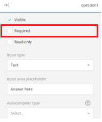
Repository
Logic
Under the Logic Section, the following configurations are available:
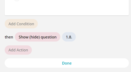
- Visible if This question will be visible to the respondent based on the configuration made in the 'Visible if' field. In the following example, the question (1.4) will only be shown to the respondent if the answer to a previous question (1.2) is "Yes".
To make this configuration:
The configuration box will appear

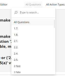
From the Select drop-down, select the required question (the question will be displayed with its Question Name as defined in the General Settings). In this example, we selected the previous question 1. Row 1. Column 1.)
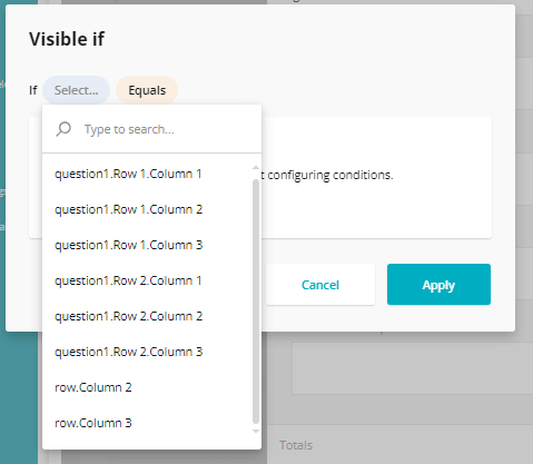
Here you can enable column number from the drop-down menu
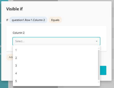
Once the configuration is made, click Apply
The Configuration will now apply to the question, which is reflected in the Visible if field
In a similar way, you can add multiple visible if configurations to your questions.
Editable if This question can only be answered by the respondent based on the configuration made in the 'Editable if' field. An example is shown below

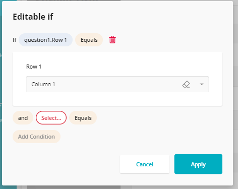
This means that if the respondent's answer to Question 1 contains the term 'Human Resources', only then can this question be answered by them.
Required if This question will have to be mandatorily answered by the respondent based on the configuration made in the 'Required if' field.\ An example is shown below
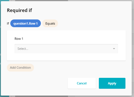
This means that if question1. Row 1. is answered by the respondent, then this question will have to be mandatorily answered
Default value expression
Totals
Under the Layout Section, the following configurations are available:

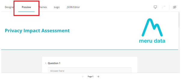
Preview Tab
On the Preview tab you can preview the configured survey. Here, you will also be able to answer the survey as the respondent would to see how the survey appears to the respondents.
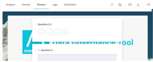
 Themes Tab
On the Themes tab, you can configure the themes for the survey, such as the background color, font, font size etc. To configure the theme of your survey, click on the Theme Settings icon
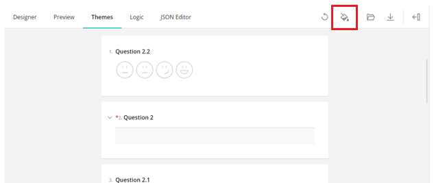
Here, you can configure the themes for the survey:
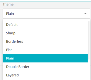
 General
Under the General Section, the following configurations are available:
- Theme
From the drop-down select the theme for the survey
Light/Dark theme Select a Light or Dark theme for the survey
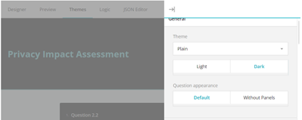
Question appearance The panels for the questions can be removed by selecting 'Without Panels'. On removing the panels, the questions will be displayed as in the example below
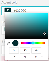
Accent color Set the accent color for the survey. Click on the
 icon and the color configuration box
will open, here you can pick the color as per your preference
icon and the color configuration box
will open, here you can pick the color as per your preference
Background color Similarly, you can set the background color for the survey by clicking the
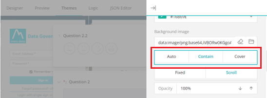
iconBackground image Click on the
 icon to browse your device and add a
background picture to the survey. An example is show below
icon to browse your device and add a
background picture to the survey. An example is show below
Auto/Contain/Cover Next choose how you want the background picture to be displayed
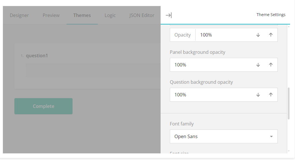
Opacity Here you can set the opacity of the background picture
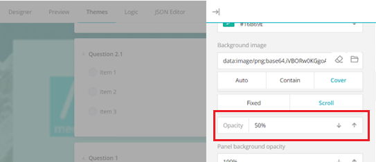
Panel background opacity Here you can set the opacity of the question panels
Question background opacity
Font Family Here you can select the font for the questions

Font size Here you can set the font size
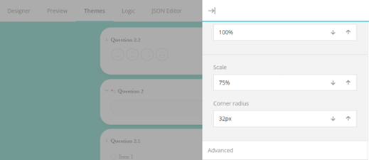
Scale Here you can define the scale of the questions. For example, a lower scale will display the questions with the panels in a small size

Corner Radius Here you can define the corner appearance of the panels
Advanced Settings
Under the Advanced Settings Section, the following configurations are available:
Background color Here again, you can adjust the background color for the survey
Accent background
Default: Here you can set the color for the Accent
Opacity
Hover
Opacity
Selected
Opacity
- Accent foreground
Default color
Opacity
Disabled color
Opacity
- Survey title font
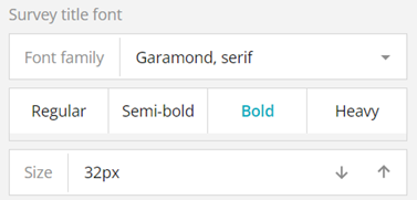
Font family: Here you can select the font for the survey title
Regular/Semi-bold/Bold/Heavy: Select the appearance of the survey title here
Size: Enter the size of the survey title here
- Page title font
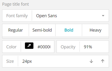
Font family: Here you can select the font for the page title
Regular/Semi-bold/Bold/Heavy: Select the appearance of the page title here
Color: Set the color for the page title here
Color Opacity: Define the opacity of the page title here
Size: Enter the size of the page title here
- Page description font
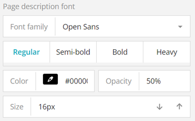
Font family: Here you can select the font for the page description
Regular/Semi-bold/Bold/Heavy: Select the appearance of the page description here
Color: Set the color for the page description here
Color Opacity: Define the opacity of the page description here
Size: Enter the size of the page description font here
- Panel Background and corner radius
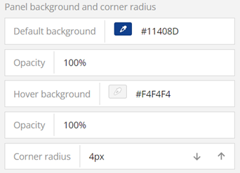
Default Background: Set the color for the panel background here. In the example below, the color has been set to dark blue

Opacity: Set the opacity of the panel here
Hover background
Opacity:
Corner radius: Set the corner radius for the panels here
- Shadow effects
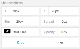
X: Set the shadow effect for the right side of the panel here
Y: Set the shadow effect for the bottom of the panel here
Blur: Set the blur intensity of the shadow effect here
Spread: Set the extent of the shadow effect here
Opacity: Set the opacity of the shadow effect here
Drop: This setting places the shadow effect outside the panel
Inner: This setting places the shadow effect inside the panel
- Question title font
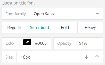
Font family: Select the font of the question title here
Regular/Semi-bold/Bold/Heavy: Select the appearance of the question title font here
Color: Set the color of the question title font here
Opacity: Set the opacity of the question title font here
Size: Set the size of the question title font here
- Question description font
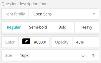
Font family: Select the font of the question description here
Regular/Semi-bold/Bold/Heavy: Select the appearance of the question description font here
Color: Set the color of the question description font here
Opacity: Set the opacity of the question description font here
Size: Set the size of the question description font here
- Input element
Here you can configure the settings for the area of the question panel
where respondents enter their answers
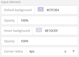
Default background: Set the background of the input/answer area
Opacity: Set the opacity of the input/answer area
Hover background
Opacity
Corner radius: Set the corner radius of the input/answer area
- Input element shadow effects
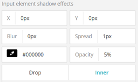
X: Set the shadow effect for the side of the input/answer area here
Y: Set the shadow effect for the bottom of the input/answer area here
Blur: Set the blur intensity of the shadow effect here
Spread: Set the extent of the shadow effect here
Opacity: Set the opacity of the shadow effect here
Colour: Set the color of the shadow effect here
Drop: This setting places the shadow effect outside the input/answer area
Inner: This setting places the shadow effect inside the input/answer area
- Input element font
Here you can set the font of the input/answer area font
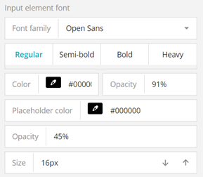
Font family: Select the font of the input area font here
Regular/Semi-bold/Bold/Heavy: Select the appearance of the input area font here
Color: Set the color of the input area font here
Placeholder color
Opacity: Set the opacity of the input area font here
Size: Set the size of the input area font here
- Minor line colors
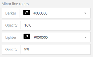
Darker:
Opacity
Lighter
Opacity
Logic Tab
This tab displays all the current logic applied to the survey.

All Questions
Click on this button to search for any questions to which logic has been
applied
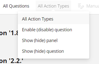
All Action Types
Click on this button to search for any applied action types/logic
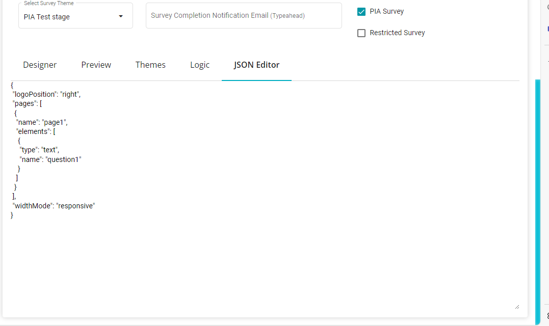
JSON Editor
In this log, you can code in your specifications in your required format.